How to Build a Strong Social Media Brand Identity on a Small Budget in 2026
SnapReel
May 19, 2026 · 14 min read
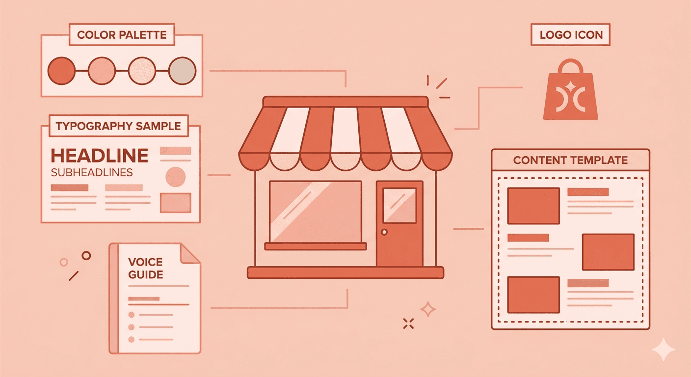
Table of Contents
Most small brand owners believe brand identity is something you build after you have money. A professional logo. A brand photoshoot. A designer on retainer. The nice-to-have layer you add once the business is generating enough revenue to invest in looking the part.
This belief is one of the most expensive mistakes in small business marketing. And in 2026, it is more costly than ever.
Brand identity is not decoration. It is recognition infrastructure. Research consistently shows that brands presenting a consistent visual identity across platforms see revenue increases of up to 33% compared to inconsistent brands. Not because the logo is prettier. Because recognition builds trust, and trust converts. Every inconsistent piece of content your brand produces — the wrong color, the different font, the caption that sounds like a different person wrote it — is a micro-erosion of the recognition you have worked to build.
The good news for small brands in 2026 is this: the tools required to build a genuinely strong, professional brand identity now cost almost nothing. What has historically cost tens of thousands of dollars in agency fees can now be built in a weekend with free tools, clear thinking, and a one-page document that keeps everything consistent. The barrier is not budget. The barrier is knowing what to build and in what order.
This guide is the complete framework — from the strategic foundation to the visual system to the content templates — for building a social media brand identity that makes your brand recognizable, trustworthy, and consistent, on a real small brand budget.
Why Brand Identity Matters More in 2026 Than It Ever Has Before
The social media feed in 2026 is more visually saturated than at any point in history. AI tools have democratized design, which means polished-looking content is no longer a differentiator. Every brand can produce a clean graphic. Every brand can generate a professional-looking image. The abundance of competent-looking content has paradoxically made distinctiveness — having a visual identity that is specifically and recognizably yours — more valuable than it has ever been.
There are now 5.66 billion social media users worldwide. In that volume of content and competition, forgettable brands disappear fast. The brands that survive and grow are the ones people can identify before they even read the caption — because the color, the layout, the typography, and the overall feel have been repeated consistently enough to create genuine recognition.
In 2026, brand identity also matters because social media platforms are increasingly functioning as search engines. When someone searches for your category on Instagram, TikTok, or YouTube, the first impression your brand makes is visual. A cohesive, recognizable visual identity signals credibility to a new audience before a single word of your content is consumed. An inconsistent visual identity signals that the brand is not serious — or worse, not real.
Purpose-driven brands with clear identities grow two to three times faster than their competitors, because 64% of buyers choose brands that align with their values — and visual identity is the most immediate signal of what your brand values and how seriously it takes itself.
The investment required to build that identity in 2026 is not money. It is clarity and consistency applied systematically.
The Five Components of a Social Media Brand Identity
Before building anything, you need to understand what a complete brand identity actually consists of. Most small brands focus on the logo and stop there. A real brand identity has five distinct components that work together to create consistent recognition.
Component One — Visual Identity
This is the part most people think of first: your logo, color palette, typography, and imagery style. These are the elements people see before they read or hear anything. A strong visual identity is immediately recognizable, applies consistently across every platform, and can be identified without your brand name being visible. If you removed your logo from your last ten posts, would people still know it was you? If the answer is no, your visual identity is not doing its job.
Component Two — Voice and Tone
This is how your brand sounds in every written and spoken interaction — your captions, your replies, your bio, your Stories text. Voice is constant across all contexts. Tone shifts slightly depending on the situation — more playful in a product launch, more sincere in a customer service moment — but the underlying personality never changes. A brand with a strong voice sounds like itself in every post, regardless of who wrote it.
Component Three — Content Pillars
These are the three to five recurring themes your brand creates content around. Content pillars give your feed structural coherence — someone looking at your profile for the first time should be able to understand immediately what your brand is about and what kind of content to expect. Pillars also make content creation faster and more consistent because they define the decision space before you sit down to create.
Component Four — Profile and Platform Presentation
This is the outer shell of your brand on each platform — your profile photo, bio, link, cover image, highlights, and pinned content. These elements are the front door of your brand. They need to communicate clearly and consistently what you do, who you serve, and why someone should follow you. Most small brands underinvest here and update their actual content far more frequently than they update the infrastructure that frames it.
Component Five — Brand Guidelines Document
This is the single document that ties everything together and prevents the gradual drift that erodes most small brand identities over time. A one-page brand guide covering your colors, fonts, logo usage rules, and voice guidelines is the most practical brand investment a small brand can make. You do not need a fifty-page agency document. You need a single reference that removes guesswork from every content decision going forward.

Building Your Visual Identity — The Budget-First Approach
The visual identity is where most small brands start, and it is where most small brands overspend or underbuild. Here is the sequence that actually works on a minimal budget.
Step One — Choose Your Color Palette
Your color palette is the single most powerful visual consistency tool available to a small brand. When applied consistently to every piece of content, it creates recognition faster than any other element. You do not need a designer to choose a color palette. You need three to five colors that work together and feel authentic to your brand's personality.
A practical approach: choose one primary brand color that will dominate your visual presence, one secondary color for contrast and accent, one neutral color for backgrounds and text, and optionally one highlight color for calls to action. Lock these colors down with their exact hex codes — not approximate shades, but specific codes — and use only those codes in every piece of content you produce. The discipline of color consistency is worth more than the brilliance of the original color choice.
Free tools for this: Coolors.co generates palette options from a single starting color. Adobe Color builds palettes from color theory principles. Both are completely free and produce professional-quality results.
Step Two — Choose Two Fonts
Typography is the second most powerful visual consistency signal after color. Most brands need exactly two fonts: one for headings and display text, and one for body copy. The heading font carries personality — it can be distinctive, expressive, and specific to your brand's character. The body font prioritizes readability — it should be clean and legible at small sizes across all screen types.
Choose fonts that contrast well with each other — a bold, character-heavy heading font paired with a clean, simple body font is the most reliable combination for small brands. Lock down your two fonts and use them for every piece of content you produce. Never introduce a third font because a particular graphic "looked better" in something else. That single decision, repeated across dozens of posts, is how brand font identity erodes.
Free tools: Google Fonts has hundreds of professional-quality fonts available at no cost. Canva's free plan includes access to a large font library. Both support consistent use across all content formats.
Step Three — Develop a Logo System
Your logo needs to work in multiple configurations: a primary version for headers and large applications, a simplified version for small applications like profile photos and favicons, and ideally a wordmark version for contexts where the symbol alone is not recognizable enough. You do not need all of these on day one. Start with a primary logo and a profile photo version.
Free and low-cost tools for logo creation in 2026 include Canva (free), Looka (paid but affordable), and Figma (free for basic use). If budget allows even a small amount, hiring a designer on Fiverr for a simple logo brief typically costs between fifty and two hundred dollars and produces significantly better results than self-designed logos for brands without design experience.
Step Four — Define Your Imagery Style
Your imagery style is the visual approach you take to photos, graphics, and video — and it needs to be consistent enough that your content is recognizable in a mixed feed. Define a small number of rules: Do you use people in your content or not? Do you use flat lay photography or lifestyle photography? Do you use illustrated graphics or photo-based graphics? Do you use bright, high-contrast images or muted, film-toned images?
Pick a style that is authentic to your brand and producible consistently with the equipment and skills you actually have. The most consistent brand imagery is not necessarily the most technically sophisticated — it is the most repeatable. A consistent phone camera photography style with consistent lighting and consistent backgrounds beats a mix of professional photography and phone shots that look like they came from different brands.
Building Your Content Templates — The Consistency Multiplier
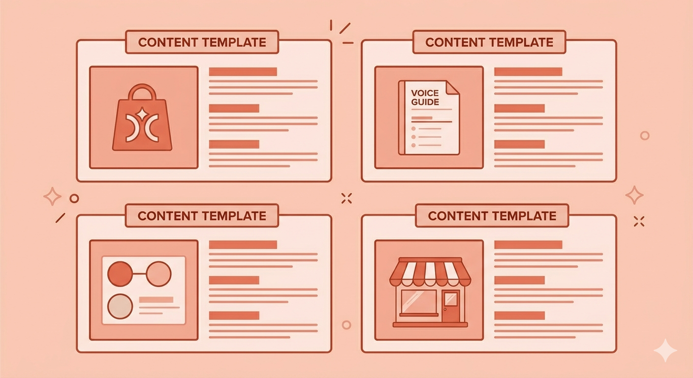
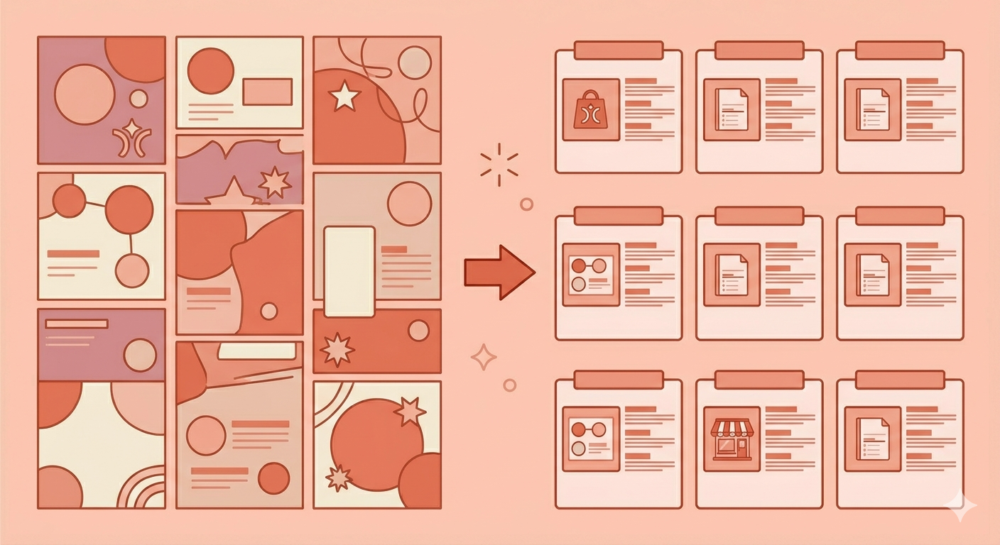
Content templates are the most underused tool in small brand identity building, and they are completely free to create. A template is a reusable design layout that you fill with new content while keeping the structure, colors, fonts, and overall aesthetic consistent. When your educational posts always use the same layout, your product posts always use the same visual format, and your quote posts always use the same typographic treatment, your feed develops a visual coherence that builds recognition at scale.
For small brands in 2026, the minimum viable template library is three to five templates — one for each of your content pillars. These templates live in Canva, are duplicated for each new post, and are updated only with the new content while every design element stays constant.
The payoff of this system is enormous relative to the investment. Creating content from a template takes a fraction of the time of designing from scratch. Every post reinforces the same visual identity. And the cumulative effect of dozens of posts using the same visual system is genuine brand recognition — the kind that makes people identify your content before they see your name.
The One-Page Brand Guide — Your Most Important Document
Every piece of brand identity work you do is only as valuable as your ability to apply it consistently. The one-page brand guide is the tool that makes consistent application possible — whether you are creating content yourself, working with a team member, or briefing a freelancer.
A complete one-page brand guide for a small brand covers the following:
Your primary brand color and its exact hex code. Your secondary and neutral colors and their hex codes. Your heading font name and weight. Your body font name and weight. Your logo — primary version and simplified version. Three to five words that describe your brand voice. Two or three examples of on-brand captions or copy. Two or three examples of off-brand captions or copy. Your three to five content pillars listed clearly. Your profile photo and bio text for each active platform.
This document should live somewhere accessible — a shared folder, a pinned note, a Notion page — so that anyone creating content for your brand can reference it instantly. Its purpose is not comprehensive documentation. It is the removal of guesswork from everyday content decisions.
The brands that maintain the strongest visual consistency over time are not the ones with the most elaborate brand guidelines. They are the ones with a simple, practical document that they actually use. HubSpot's brand team built their original style guide in Google Slides — a free tool — and that is exactly the level of overhead you need. The sophistication of the format matters far less than the discipline of the application.
Build a consistent
Create AI-powered videos and auto-post to all your platforms.
Platform-Specific Application — Same Identity, Different Expressions
Your brand identity stays consistent across all platforms. How you express it adapts to each platform's specific requirements and culture. This is not inconsistency — it is platform fluency with a consistent identity foundation.
Instagram rewards high-quality visuals and short-form video. Your visual identity applies to your grid aesthetic, your Reels cover frames, your Story design templates, and your carousel layouts. Consistency across these formats creates a profile page that looks intentional and trustworthy to new visitors.
TikTok rewards motion and pace over static polish. Your visual identity applies through your color palette in overlaid text, your font choice in captions, and the consistent visual framing of your video content. The consistency signals that come through on TikTok are more about recurring visual habits — the same camera setup, the same framing style, the same graphic treatment — than about static design perfection.
LinkedIn rewards credibility signals and professional depth. Your visual identity applies through consistent use of your color palette in any graphics you share, consistent typography in any carousels or infographics, and a bio that matches the voice and positioning of your other platforms.
The rule across all platforms is the same: the core identity elements — color, typography, logo, voice — never change. The content format, length, and production approach adapt to what each platform rewards.
The Consistency Test — How to Know If It Is Working
Once you have built your brand identity system and applied it for thirty to sixty days, you can run a simple test to assess whether it is working.
Show ten recent posts from your feed to someone unfamiliar with your brand. Remove any text that mentions your brand name. Ask them: based on these posts, what would you say this brand is about, and does it feel like one brand or several? If they can accurately describe your category and it feels like one coherent brand, your identity system is working. If the answer is vague or if the posts feel inconsistent, you have identified where the system is breaking down.
The most common breakdowns are color drift — using approximate shades instead of exact hex codes — font creep — introducing a third or fourth font for a specific post and then continuing to use it — and voice inconsistency — captions that sound different because different moods or different people wrote them without the guidelines open.
Each of these is fixable. The system exists to prevent them. But running the consistency test regularly keeps you honest about whether the system is actually being applied or just existing in a document nobody checks.
Starting Today — The Minimum Viable Brand Identity
If you are starting from scratch or rebuilding an inconsistent brand identity, the minimum viable version that actually moves the needle is smaller than you think.
Week one: choose your color palette and lock down the exact hex codes. Choose your two fonts. Update your profile photo and bio on every platform you use.
Week two: create three content templates in Canva using your colors and fonts — one for educational content, one for product content, one for community content. Write your one-page brand guide.
Week three: create your first five to ten pieces of content using the templates. Apply the voice guidelines you documented. Run the consistency check.
That is a brand identity system built in three weeks with no budget spent beyond your time. It is not a finished, polished agency-level identity. But it is a consistent foundation that you can build on, refine, and strengthen every month as you learn what resonates with your specific audience.
The brands that win in 2026 are not the ones with the biggest budgets. They are the ones with the clearest point of view and the discipline to express it consistently. Both of those things are available to every small brand — regardless of the numbers in their bank account.
SnapReel AI helps small brands apply their brand identity consistently across all social media content at scale — generating videos and posts that match your brand voice, visual style, and content pillars automatically, so your identity stays consistent even when you do not have time to design and write every piece of content from scratch.